A good restaurant brochure design can be a terrific marketing tool for restaurants. In fact, today’s most successful restaurants are using a variety of print marketing materials, including business cards, menus, newsletters, and yes, even restaurant brochures. A well-designed restaurant brochure, like menus and business cards, can help your customer remember you when they’re in the mood to eat out.
There is no single ideal restaurant brochure design. A casual restaurant might choose a modern brochure design that looks more like a kids’ menu or coupon book, while a fine-dining establishment might prefer something on the more elegant side of things.
No matter what design you choose for your restaurant brochure, the most important thing is that it reflects your brand’s personality. Of course, it should also be visually appealing and make a good first impression on diners.
The following pages offer some brochure design ideas that you can use as inspiration to help create your own restaurant brochure design.

1. Staple Binding, 3-panel
One of the more traditional ways to present a brochure is a tri-fold brochure design, with three panels stapled together along the left edge. This sort of booklet should have a fairly straightforward design, with a solid color used for the brochure cover design and a complementary color used on the inside panels.
The outside panels of this restaurant brochure feature a large photo of the restaurant’s exterior along with some text about hours and contact information.
If you need to make a 3-panel brochure, you can with Venngage. It’s also easy to print; just make sure that your printer will handle the paper size you’re using.
2. Spiral Binding, 4-panel
Spiral binding is another common option for restaurant brochure design. This style allows your brochure to lie completely flat when it’s open, which will appeal to people who want to be able to refer back to something while they’re eating. The pages of a 4-panel brochure should be printed on both sides. Each panel is one page, so the inside panels will need to mirror each other.
The cover of this restaurant’s spiral-bound brochure uses a large photo and strong colors that contrast with the neutral tones used for the inside panels.
3. Saddle Stitch Binding, 4-panel
A 4-panel brochure that uses a saddle stitch binding is the most popular option for casual and upscale restaurant menus. This style has panels that lie flat when they’re open, so it’s perfect for showing off your menu items in detail. Like the spiral-bound brochure, each panel is one page. To create this brochure, just print the inside panels upside down. For example, if you want to print this brochure in color, the front panel would be printed in cyan and magenta, while the back panel would be in yellow and black.
The cover of this restaurant’s 4-panel brochure features a headline over an image of their most popular entrée. The inside panels feature a variety of photos that convey the restaurant’s atmosphere and food.
4. Coated Paper, 6-panel
The 6-panel brochure design is a more creative brochure design than usual. This style uses coated paper to give your brochure an elegant appearance that makes it seem upscale. Like other brochure designs, each panel is one page. When designing this style, you have the option of printing the panels in black and white or using a four-color process to add some color.
A 6-panel brochure can be used for more than just a menu. It would work well for a full-featured promotional piece about your restaurant, including photos of your restaurant’s atmosphere, menu items, and special promotions.
5. Ring Binder, 4-panel
There are several different ways to bind a brochure with rings. The simplest way is to print the inside panels in black and white on non-glossy paper and put them in clear sleeves. A more elegant way to bind a brochure is with a four-color process. In this case, you should fold the cover and inside panels in half before inserting them into the ring binder sleeve.
A 4-panel brochure can be used for a variety of purposes. For example, a restaurant that offers multiple services might use one panel for its menu and another for its catering services. This brochure’s inside panels have an interesting design that includes a large photo and vertical text blocks at the top and bottom of each page.
6. Coil Binding, 2-panel
Another good option for printing a restaurant brochure is to use coil binding along with two printed pages. To bind this style, you’ll need to use a coil binding machine or purchase pre-made coils. You can also print the pages on two different-sized paper to save money.
This restaurant’s brochure has an elegant design that features a large photo of their outdoor patio and bar area along with some copy about their services. The inside panels feature photos of their bar menu items.
7. Poly-Tabs, 4-panel
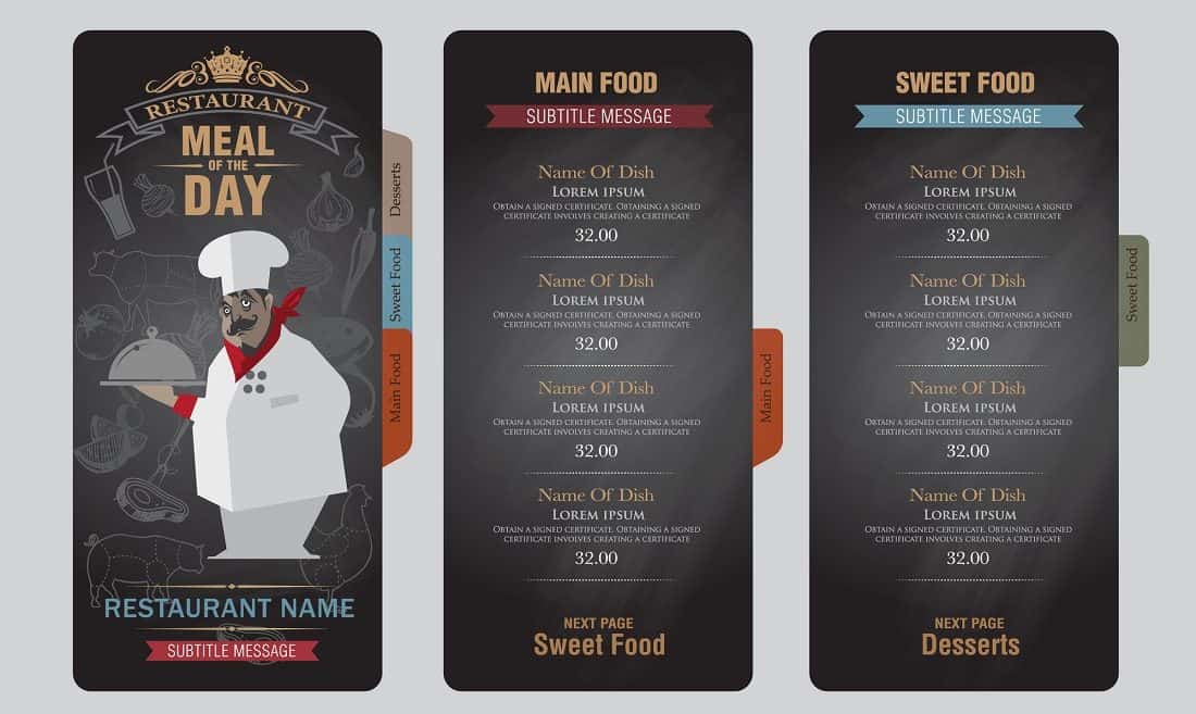
This restaurant menu uses a poly-tab design to create a distinctive and colorful brochure. The tabs are printed with the item descriptions and prices so they’re easy to flip through while you’re deciding what to eat. When designing this brochure, be sure that all of the text is easy to read from a distance. A 4-panel brochure can be an effective way to showcase your menu items and prices. For example, you could print two panels with photos of different food items and write the price under the photo. The inside panels would have a neutral background color so they’re not distracting while the customers are eating.
In Conclusion
The restaurant industry is a fast-paced, competitive business. In order to stand out from the competition and attract new customers, it can be helpful to have brochures that are designed specifically for your restaurant’s needs. You can find the one that best suits your marketing needs from these 7 different types of brochure formats.


